New Table Columns Feature for the App
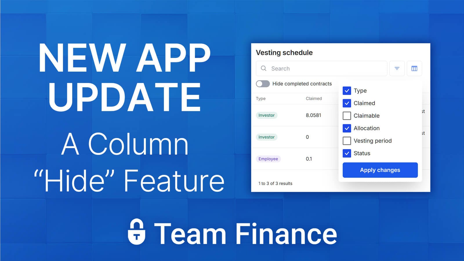
A new feature just dropped for the token management app - the ability to hide / show columns for easier access...

Help, I can't scroll horizontally on the app, and on mobile I can't see the action menu
Yes, we heard your feedback and decided it was time to make it easier for mobile users and smaller screens...
We added a new "Column Selector" for the tables in the dashboard of the app.

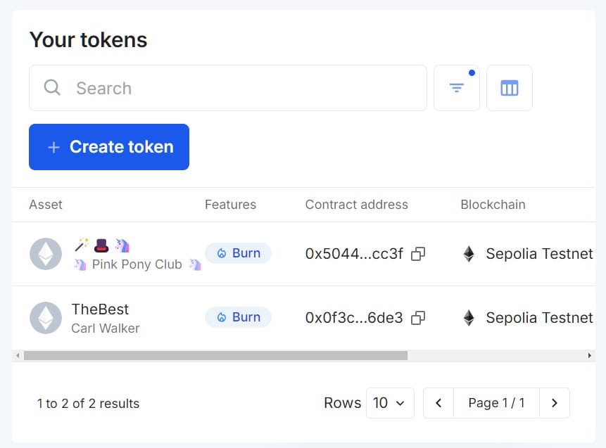
I'm using the "Token Creator" section of the app, displaying all my previously minted tokens.
You can see the horizontal scroll bar on smaller viewports, making it difficult for easy access to vital information, and the all important Action menu.

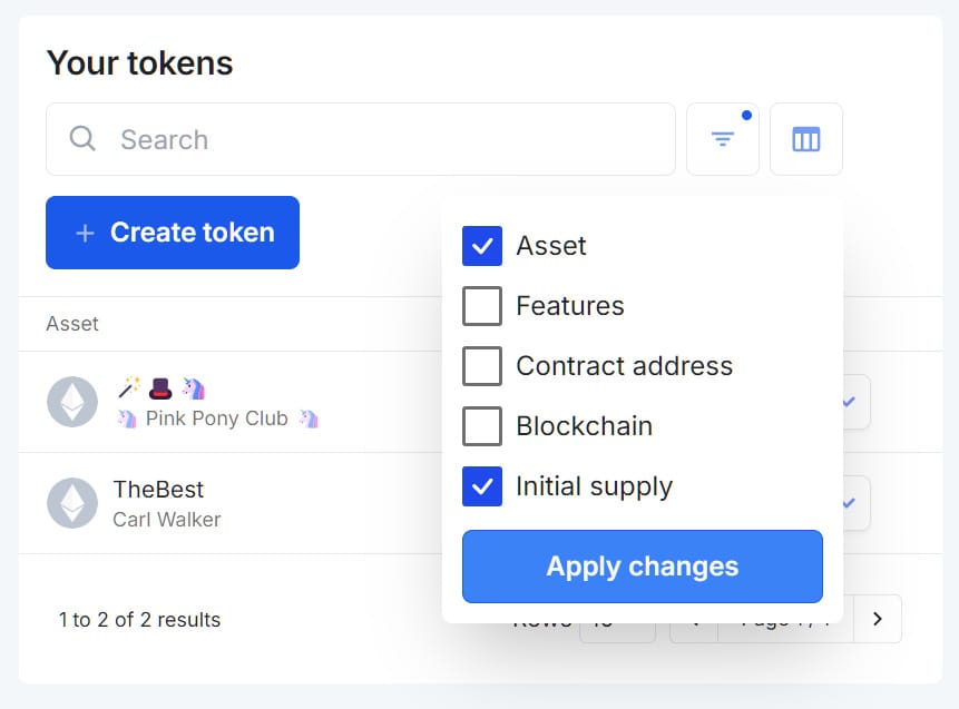
Clicking the Table icon (next to the Search & Filter buttons), will open up a popup that allows you to set your preferences for which columns you want visible at all times.
You can see I selected "Initial Supply" and "Asset" for quick reference when using the app on mobile.

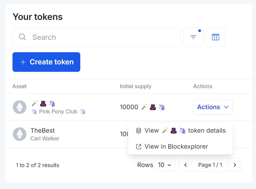
A much cleaner interface now that I have my columns hidden.
Thanks to everyone for the suggestion, as always - we want to hear from you. So get in touch with our team on the contact page, or "Request A Feature" from the app.

